Motivation
Inspectors and explorers have different strengths and weaknesses:
- Inspectors:
- Offer more features: changing variables, drag’n’drop, truncation of long lists, most seamless stepping and error handling, introspection (copy expression/debug getter/…)
- Currently widest support for different domains: collections, block closures, compiled methods, morphs, …
- Can be customized by both users (custom fields) and domain developers (object-specific fields and menus)
- Explorers:
- Provide an immediate overview of all values in an object ➡️ faster navigation, serendipitous discoveries
- Support hierarchical navigation through nested objects
How can we combine the best of both tools?
Approach
Use the more profound technical foundation of the inspector and extend it with an explorer-like, hierarchical UI.
Case Study 1: Hierarchical Inspectors
- The tree contains the fields of the inspector:
- The first field (
self) becomes the root of the tree. - All other fields become the children of the root node.
- Every tree node displays the name and the current value of the field.
- All fields (but the first one) contain nested children from an inspector on their value.
- The first field (
- The tree is expanded to the width of the inspector, the value pane moves below the tree in place of the expression pane. The expression pane is removed.
- Value pane and menus operate on the inspector that belongs to the selected field (not yet implemented).
Challenges encountered:
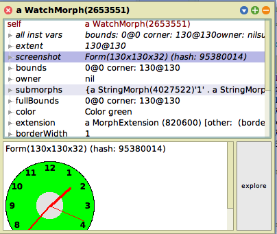
- Evaluating all inspector fields eagerly during stepping causes serious performance issues in some problems (e.g.,
World inspectbecause of the screenshot field).- ➡️ Premature solution: Time-out label computation of any field after 1 ms; for timed-out nodes, continue label computation in a background process and update the node when done.
- Deferred label updates lead to flickering in the UI; process browser may be flooded with many ephemeral processes (UX limitation of the process browser).
- Background path is reached rarely, maybe discard it.
- ➡️ Premature solution: Time-out label computation of any field after 1 ms; for timed-out nodes, continue label computation in a background process and update the node when done.
- Some field names are very long and shift values too much to the right.
- ➡️ Truncate labels (not yet implemented).
Discussion:
- Only one pane for both value display and do-its left. No longer possible to read the full contents of a field without deleting/cutting the previous do-it. Muscle memory hurt because
Cmd + i -> move cursor to the right -> typeno longer works.- People might relearn. Debugger also offers no dedicated evaluation pane.
Upstream issues observed:
- Bug: Typing do-its into the value pane with a form breaks the text editor (add fallback font?).
- Bug/inconvenience:
PluggableTreeMorphloses color of node label while selecting a node (PluggableListMorphdoes not). - Performance: Updating children and labels of single nodes is not efficient(ly possible?). Worlds with many hierarchical inspectors and stepping in debuggers with hierarchical inspectors (see below) feel (?) slightly slower.
- Bug/inconvenience: Stepping in debuggers
changed: #objectChangedturns the reported node green (temporarily disabled for the spike).
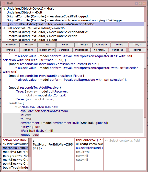
Case Study 2: Hierarchical Inspectors in Debugger
- The receiver inspector and context variables inspector at the bottom of full debuggers are replaced by hierarchical inspectors.
- The value pane of the context variables inspectors is removed and the remaning panes are arranged equally to ensure minimum readability of tree nodes.

Challenges encountered:
- Many tree items are still too long for being readable in the trees.
- ➡️ Minor layout optimization: Allow
PluggableTreeMorph>>SimpleHierarchicalListMorph>>#autoExpandSelector:to discriminate by item to save 12 px before the root item. - ➡️ Display full node label in tooltip.
- ❌ Still, not enough space.
- ➡️ Minor layout optimization: Allow
- Long field names shift values much too much to the right.
- ➡️ Limit first column width to 50 % of the tree.
- Cannot view the full contents of a context variable any longer.
- ➡️ Idea 1 (not yet implemented): Reuse central value pane for variables from both inspectors.
- Possible disadvantages: It might become less clear to which inspector the displayed contents belong. Could automatically remove selection in the second-to-last used inspector, but this might be counterintuitive.
- ➡️ Idea 2 (not yet implemented): Stack two value panes on top of each other.
- Even less vertical space within each value pane.
- ➡️ Idea 1 (not yet implemented): Reuse central value pane for variables from both inspectors.
Other design considered (not yet tried out):
- Merge both roots (
selfandthisContext) into a single hierarchical inspector (similar to mainstream debuggers with nested scopes):- More horizontal space for node labels and the value pane, but overseeing both instance and context variables at the same time would require frequent scrolling.
Case Study 3: Traditional Inspectors in Debugger, Augmented with Values
- Remain with the traditional inspectors layout in the debugger.
- Augment inspector fields with their values.
Discussion:
- More familiar, more space left for parallel inspection of receiver and context variables.
- Potential faster overview/serendipitous discoveries but no hierarchical navigation.
- Augmented values only really helpful for fields with short variable names.
- More chaotic UI
- ➡️ Display values in secondary style (greyed out/smaller)? Not yet supported in
LazyListMorphs.
- ➡️ Display values in secondary style (greyed out/smaller)? Not yet supported in
Related Work
-
Marcel Taeumel: [squeak-dev] Explorers in Debuggers displays two regular explorers in a debugger with expression panes below the trees and removes the value panes. This gives more horizontal space to the trees but (i) offers no multi-line view of a variable value and (ii) requires more vertical space in total or shrinks the height of the remaining do-it panes a lot.

Conclusion and Future Work
- Hierarchical inspectors as a standalone tool look promising. Will do further testing and try to adapt my own muscle memory.
- Adding more information into the debugger is hard because of space constraints.
- A more fundamental issue is the rigid arrangement of the debugger, which does not follow the small windows pattern seen in other tools.
- Maybe we could come up with alternative, more flexible and more Smalltalk-ish debugger layouts in the future. Protruding tool windows that are detached from the main debugger window but stick to its borders (cf. Vivide)? One-click layout presets for showing/compacting single panes (cf. Pharo debugger)? What else?